PeopleSmart
PeopleSmart is a privacy friendly people search engine that allows users to access public records information.
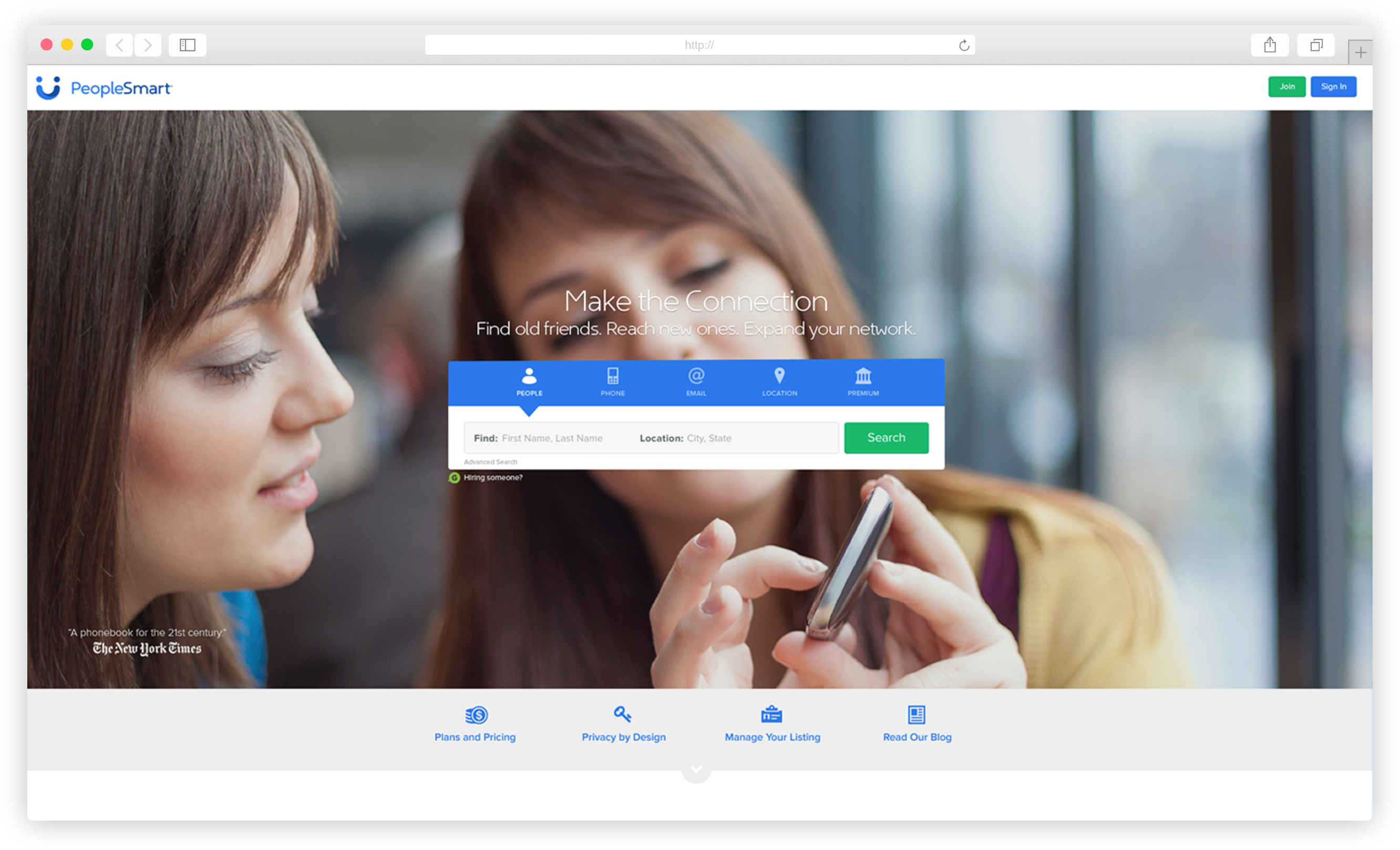
PeopleSmart is one of the three flagship products of Inflection, a company focused on building trusted connections online through identity management tools.
I am currently the Lead Product Designer for PeopleSmart, managing a team of four talented Product and UX Designers. My day to day responsibilities range from determining team strategy that supports product development to producing wireframes or high fidelity mockups for our desktop and mobile experiences.
Featured below are various projects I've worked on throughout my time on the PeopleSmart team.
Featured below are various projects I've worked on throughout my time on the PeopleSmart team.
THE PEOPLESMART CHECKOUT EXPERIENCE
Our original checkout experience
overwhelmed customers with product offerings and action steps. The redesign aimed to make this interface more intuitive.
overwhelmed customers with product offerings and action steps. The redesign aimed to make this interface more intuitive.
"STOP TRYING TO MAKE THE REGICHECK HAPPEN " - Regina George
While Regina George may have never said that, it was a common sentiment on our team. The original PeopleSmart checkout experience was internally referred to as the "regicheck," alluding to registering and checkout, two actions that were completed on that page. During its glory days the page performed excellently making our team all the more hesitant to dramatically change it.
Present day however, we were suffering from large user drop off and multiple refund requests from customers unaware of what they’d purchased. Various split tests were implemented, but none were deemed clear winners because they failed to address the root issue: a complex and cluttered interface that needed to be overhauled.
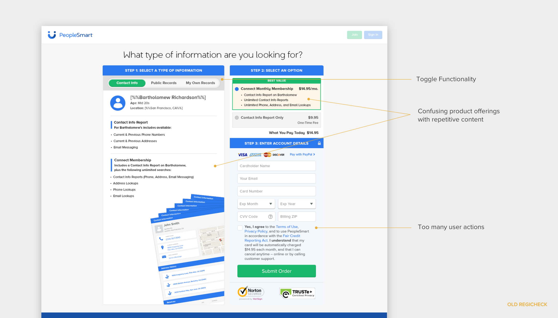
The redesign aimed to address the major pain points of the former regicheck page which were exposed [confirmed] during user interviews conducted by our UX Design guru, Hsin-Yen.
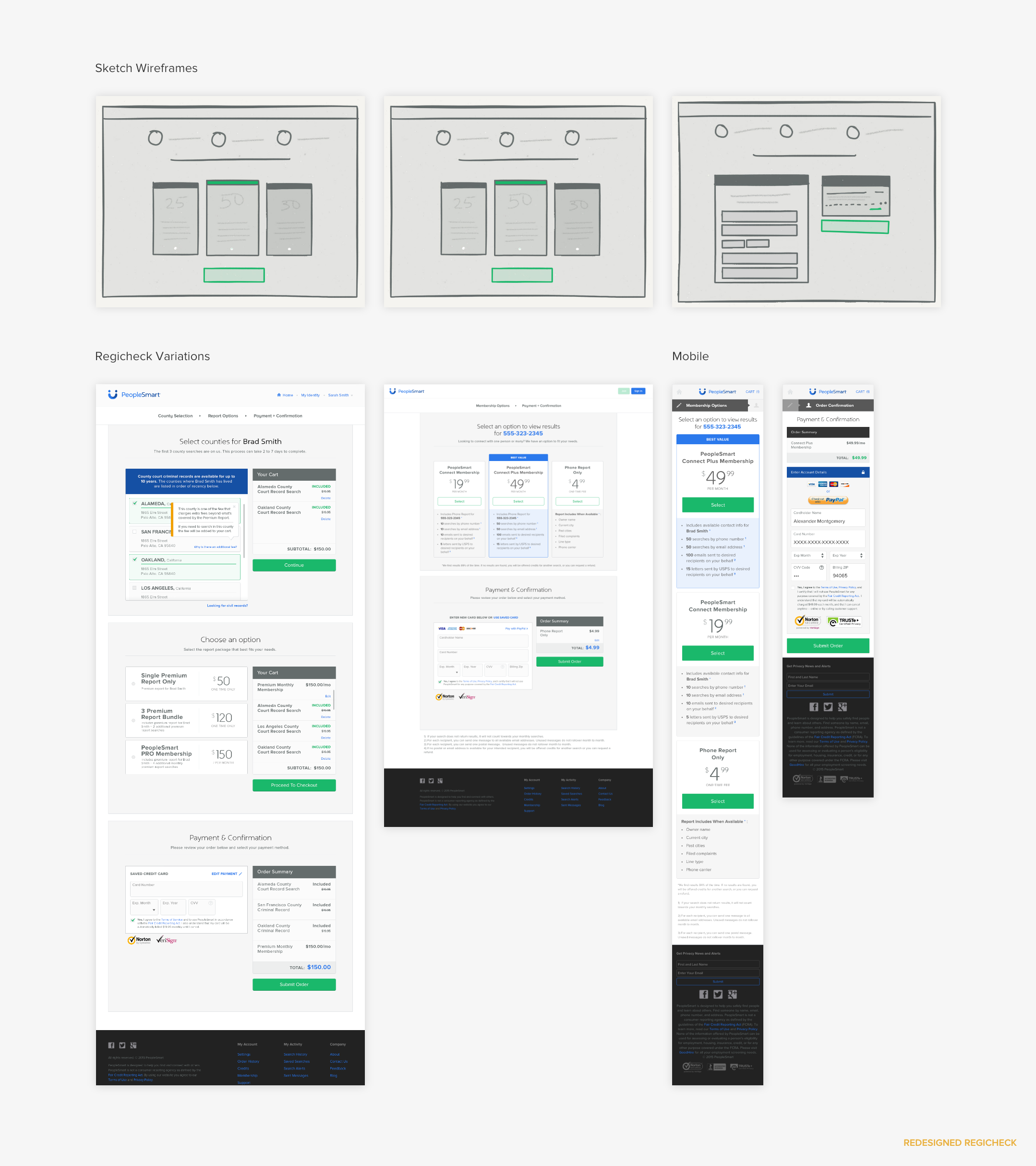
I did away with the toggle functionality which was often ignored and only served to reveal more product offerings. After working closely with the product management team we discarded redundant content and offered concise product options. Most importantly, in an effort to make the experience more intuitive, I decided to split the intended user actions into separate modules: product summary, product selection, and credit card input. The modular design offered an added benefit of being scalable so that it could be used across our user flows and adjusted to fit different contexts, as demonstrated below.
USER FLOW CONSOLIDATION & UPGRADES
PeopleSmart user flows had become complex, making the user journey difficult to understand for both our customers and product team.
PROJECT ROLE & SUMMARY
At the start of this project, PeopleSmart had over fifteen user flows that needed to be consolidated into eight; one for each of our search options. It was a huge endeavor but would allow the design team to implement updates to flows that had become clunky and confusing with size. Given the scale of the project and the intense demand it would have on our engineering team, we were tasked with making updates that would require minimal developer resources and yield major impacts to the user experience...aka become design magicians.
I was responsible for determining what quick and impactful solutions we should prioritize as a design team. Leveraging a recently completed site audit (see below) highlighting the UX pain points of our user flows, the team and I decided we should focus on brainstorming quick and impactful solutions that addressed the following flaws:
• PeopleSmart account setup
• IdentitySmart (a PeopleSmart affiliate product) bonus offer
• IdentitySmart (a PeopleSmart affiliate product) bonus offer
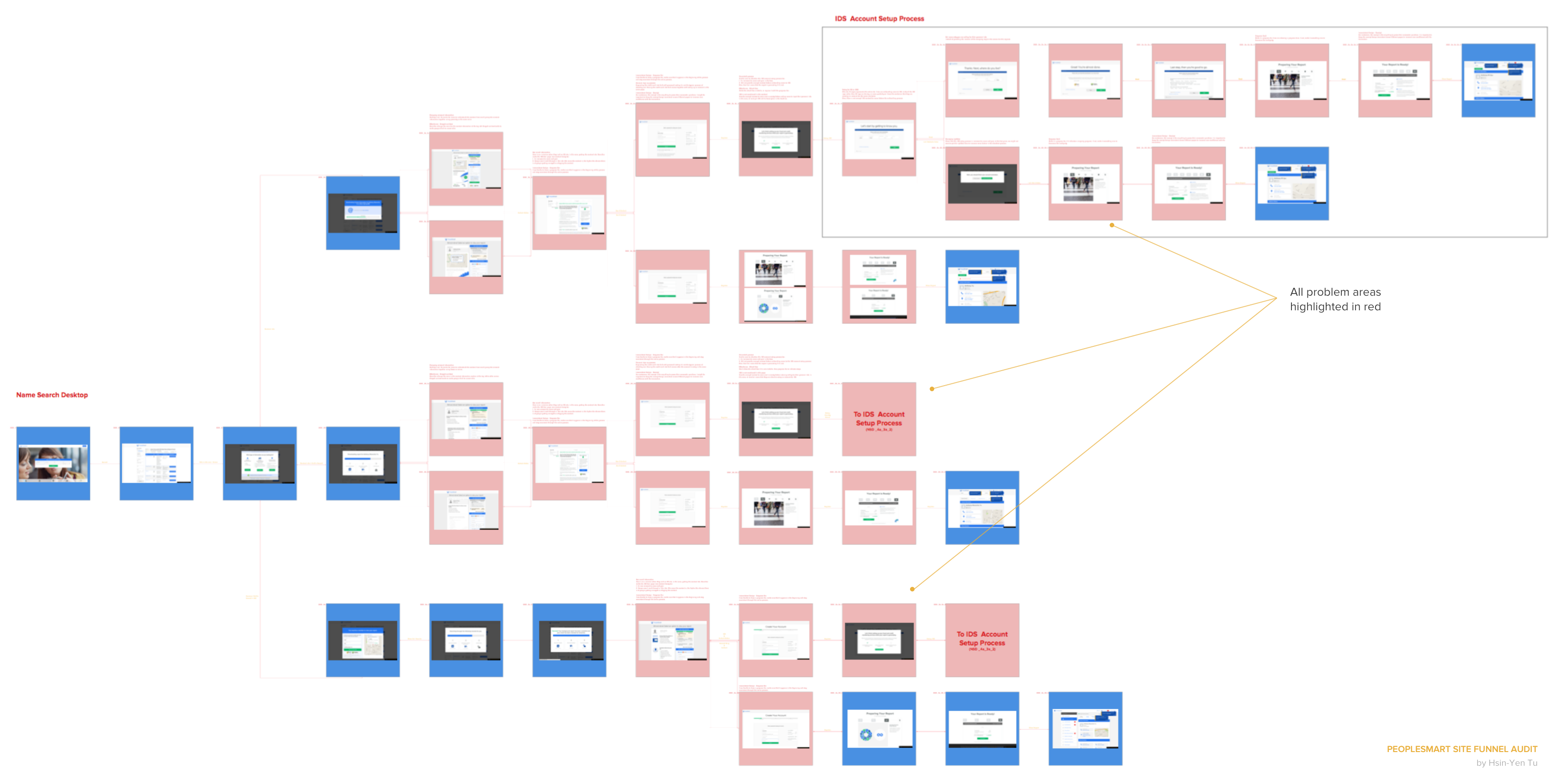
"...we were tasked with making updates that would require minimal developer resources and yield major impacts to the user experience..."
After gathering more feedback, the team learned of an additional small but impactful change. Keeping the headlines of each page within the user flows consistent and specific made customers feel each was connected. We worked with the content team to establish a template for headlines that dynamically pulled in user search inputs and flowed well between pages.
THE RESULTS ARE IN (SO FAR...)
It's now been four months since the project went live and we've already seen an average of 12-24% improvement in aggregate orders placed across the consolidated funnels. User interface upgrades have directly contributed to a 2-10% drop in customer return rates during this time period as well.
STYLE CAN'T BE TAUGHT...BUT IT CAN BE DOCUMENTED
The lack of a brand styleguide was negatively impacting our productivity rates and causing inconsistencies throughout the product.
At its start, PeopleSmart had one designer, ten years later and it has ballooned to a team of five with another working remotely in the Ukraine. The lack of a styleguide made consistency across projects difficult. I collaborated with Kaori, another amazing PeopleSmart Product Designer, to create a styleguide for the team. Kaori performed an exhaustive visual site audit of both our desktop and mobile pages, documenting the many [understatement] styles across our site. Some quick observations based on her examination, we had close to 30 different type treatments, a wide variety and sizing of call to action buttons, and a very clear obsession with gray (no seriously, we really like gray...like a lot).
Although this was a design driven project, it was a problem that affected more than just the design team, namely, our developers. After speaking with our engineering team, I realized all styles, no matter redundancy, were being recreated by our front end developers. Both developers and designers were spending valuable time recreating common elements and assets. The impact that a styleguide would have on productivity grew twice fold. I directly collaborated with our remote Lead Front End Developer, to determine the best way to approach this project and decided to divide the work into the following phases:
"It was obvious this problem affected
more than just the design team, developers were spending valuable time recreating elements to follow our design mockups."
more than just the design team, developers were spending valuable time recreating elements to follow our design mockups."
PROJECT RESULTS & UPDATES
Phase I of the styleguide has been completed and added to the creative cloud so that we can easily access it within our Adobe programs. It has also been shared with the development team so they can reflect the styles across the appropriate css style sheets. We are currently working on Phase II of this project to standardize user elements. This will be an effort requiring more user testing and a better understanding of what development constraints we would have to consider when proposing updates.
Just want to give a huge shout out to the entire PS Design team for their incredible contributions to the product: An, Hsin-Yen, Hunter, & Kaori <3
Like what you see? Well there's more:
Community Safety Web Portal
The community safety web portal provides automated background checks for peer to peer platforms quickly, accurately and at scale.
2016
Fresh 15
Inflection's 2015 recruiting campaign created to target the most talented recent graduates in the country.
2016
Inflection.com
A public records company seeking to provide users with the necessary tools to better manage their online identities.
2016