Inflection.com
A public records company seeking to provide users with the necessary tools to better manage their online identities.
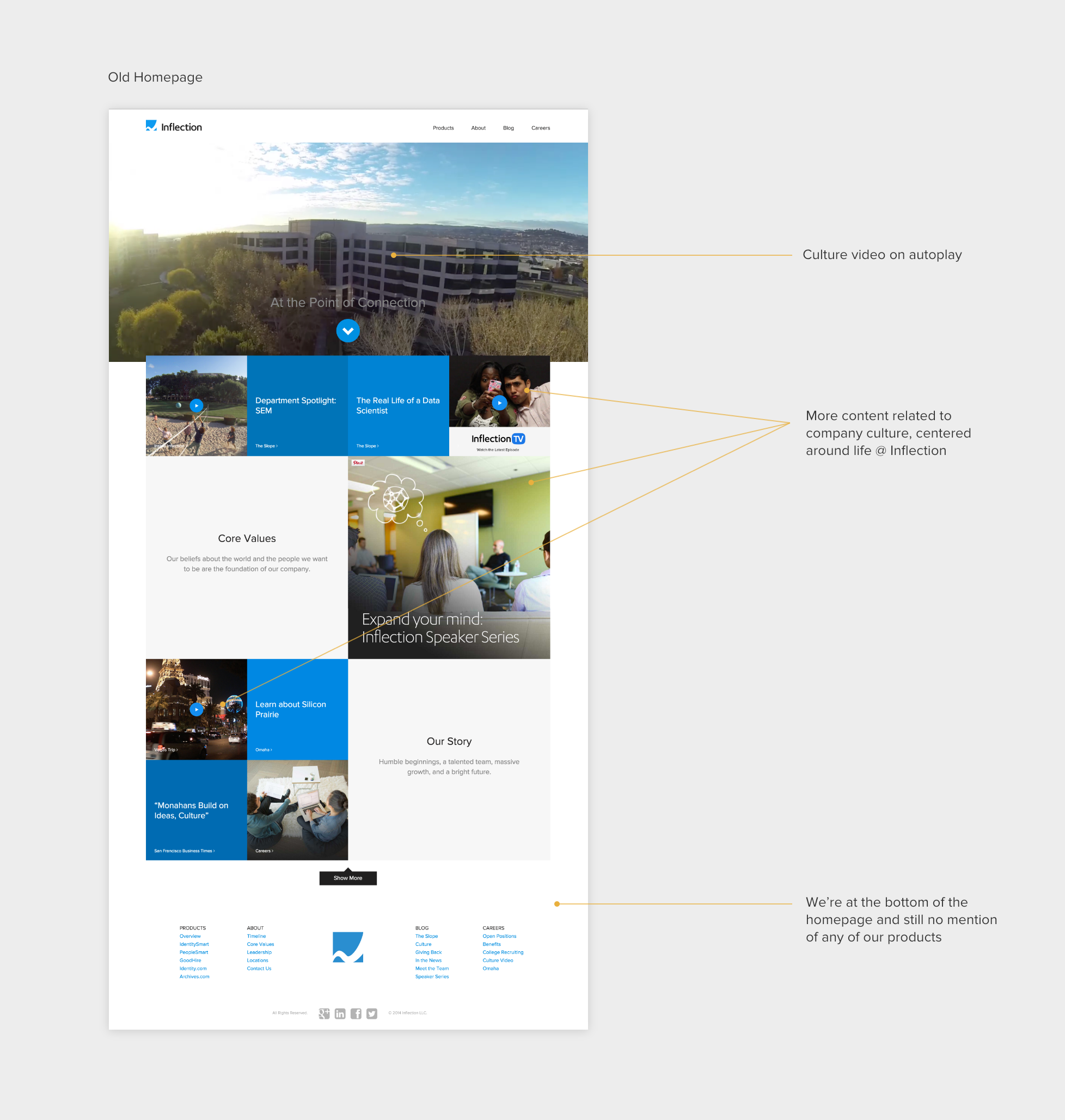
Although we are a mid level size company, the culture we’re known for has not changed much since our startup days. Our company website is the greatest tool for putting our unique culture on display in order to attract new talent and partnerships.
I was part of the brand & marketing team and responsible for the brand experience strategy and design. I lead UX/UI and visual design work, producing all deliverables and presenting them to our CEO on a biweekly basis. I worked alongside our content team (copy, video, photography), front-end developers, and project manager.
GROWING PAINS
Our company website is our greatest marketing tool to attract new talent and partnerships in Silicon Valley. In 2013, our then Creative Director did an entire brand and site redesign, bringing our website up to modern web/design standards. However, as time passed,we experienced classic growing pains. Our business strategy changed, products were given more importance within our portfolio, and we were adding more secondary pages to the site architecture, that had no place in our main navigation but were of more importance than to only be linked through our footer. Our team was assembled to effectively address these issues over the course of 6 months-8months.
SO WHAT EXACTLY DO YOU GUYS DO?
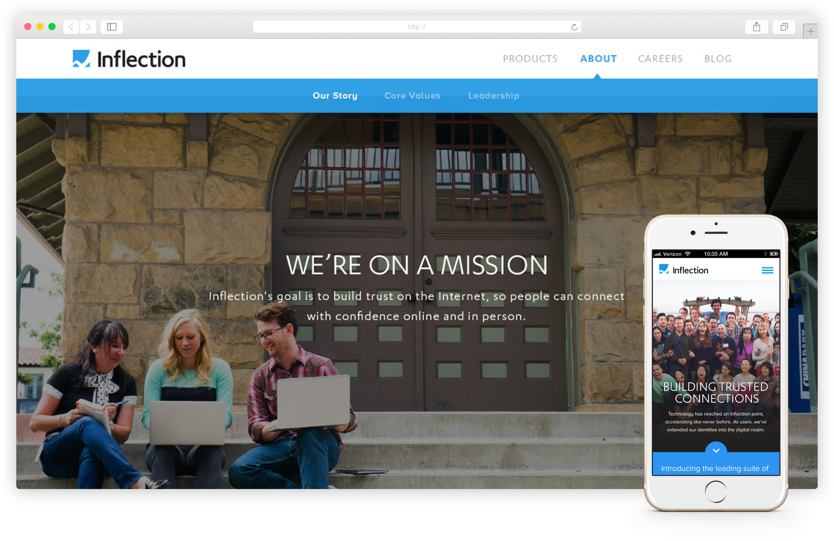
Speak to anyone who visited Inflection.com and the common question we heard was, your company looks so fun and cool but what do you guys do?
The second most commonly asked question was do you guys actually work at Inflection? [jovial tone] While we often laughed at this playful banter, it was clear to us that this was a pain point for our users. As a company we needed to do a better job of concisely conveying the value proposition of each of our products on the website so that potential business partners, investors, future employees, customers, and my parents would take us seriously. Our culture was evident but what made us revenue was being overshadowed.
SHIFTING OUR FOCUS
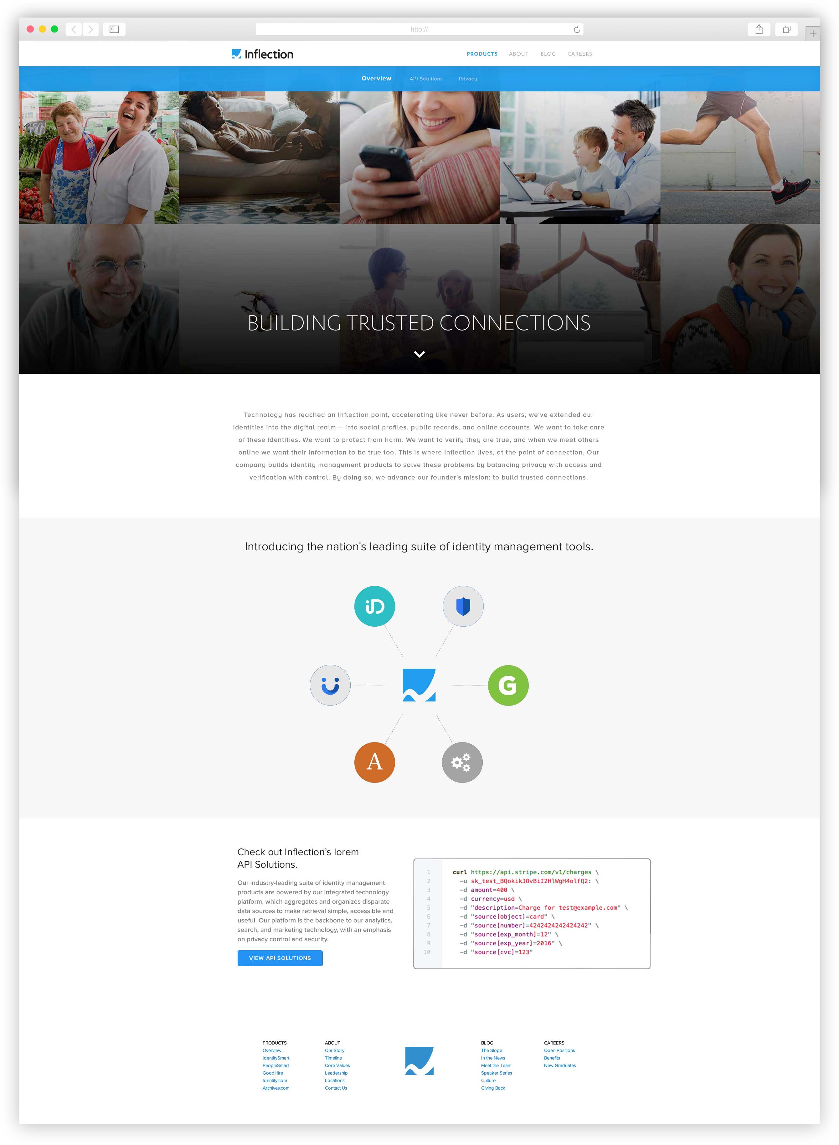
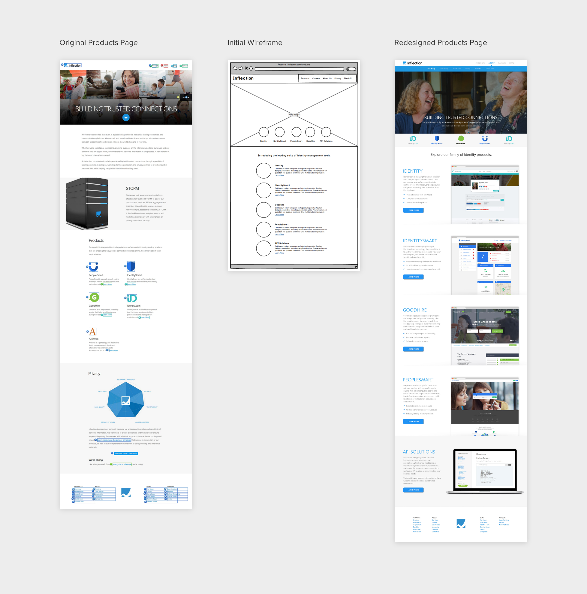
At Inflection we were no longer a company with five products pulling from our public records database. We were shifting our focus to becoming a family of products and API’s meant to better manage online identities. At the time, our products page only spoke to the former. Mainly highlighting our backend database platform with a visual of an old computer hardware machine and our products hidden below with minimal descriptions.
With the redesigned product page we wanted to drive home the idea that we were a family of products. Our initial approach tried to accomplish this with a web diagram of our products to visibly link our offerings. This approach, however, proved to be cumbersome. The web diagram interaction was clunky and wasn't easily scalable. Additionally, users had to click learn more links to get to the paragraph describing what we did, and the content wasn’t laid out in a visually compelling manner, the main issue of the original product page.
LET'S RETHINK THIS
Taking a step back from our initial approach, I realized we were only addressing one of the issues of the original page. While we were trying to find a solution to show all of the products were a family we were forgetting the biggest problem, which was that our users didn’t know what we did. By hiding the product descriptions it failed to address the main objective. With this renewed focus, I decide on the approach below. I made sure to follow the family theme by having the product icons appear in one row at the bottom of the hero section. And working with the content team we created succint product descriptions that could appear next to product screens.
DON'T GET LOST
It was decided that our original navigation system would need to be upgraded in order for these additional pages to be readily accessible to our users.
WAIT, WHERE ARE WE?
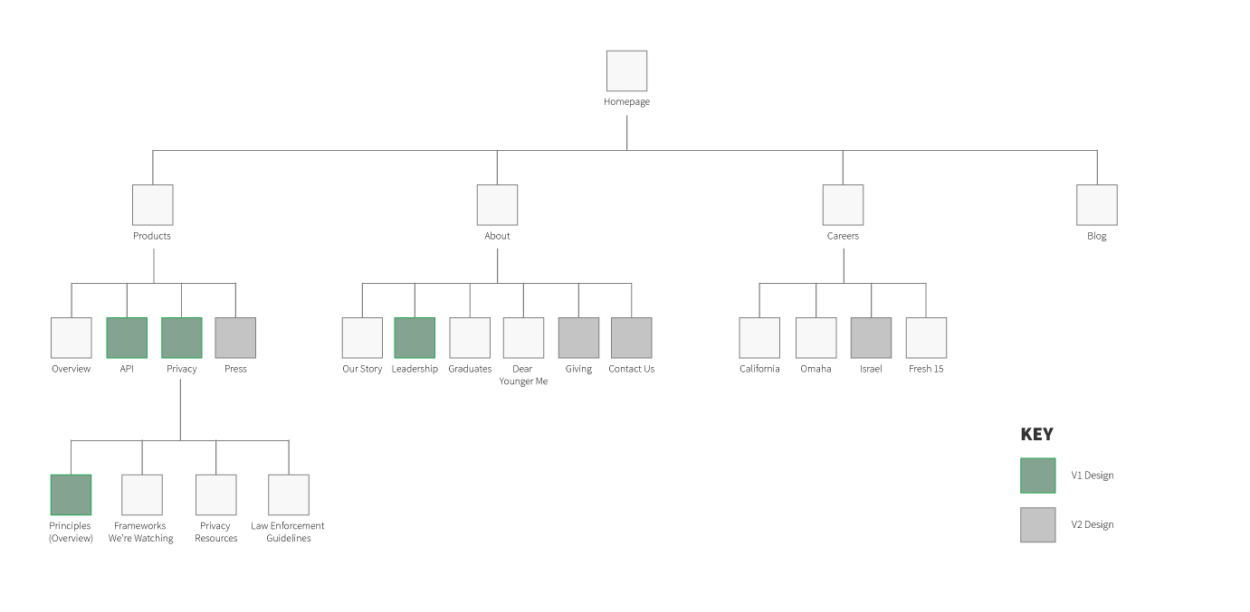
As the site redesign project continued it became noticeable that there was no clear vision of what pages were going to be added, subtracted, or discarded on the site. Every week the team would leave meetings with a new list of pages and subsections that completely differed from the previous. This was no ones fault, but more so a result of a new brand strategy that was still being finalized in contingency with this process. Consequently, this led to our team trying to account for both current and future possible pages on our site.
I realized if we didn’t decrease the scope of this project it would derail our focus on the task at hand, so I set to work creating a sitemap of our current pages and pages in production. After getting feedback from my director of design, I presented the map to the main stakeholders, our CEO and the team project manager, highlighting existing, in progress (V1 designs), and potential future (V2 designs) pages. Once we finalized that site map, I began to wireframe navigation solutions that would account for the pages mapped out but still be scalable enough to work with future cases.
RESEARCH TO BACK IT UP
In order to make an informed design decision I referenced some website tracking we had running or our highest trafficked pages. My research found that users rarely interacted with in-page links. The most engagement occurred with our main navigation and footer links when it came to navigating the site pages. Our Privacy Page, for example, an integral part of our new business strategy and a page that was being completely redesigned, was buried in the footer only getting 3% of clicks on our most visited page.
"...if we didn’t decrease the scope of this project it would derail our focus on the task at hand, so I set to work creating a sitemap of our current pages and pages in production."
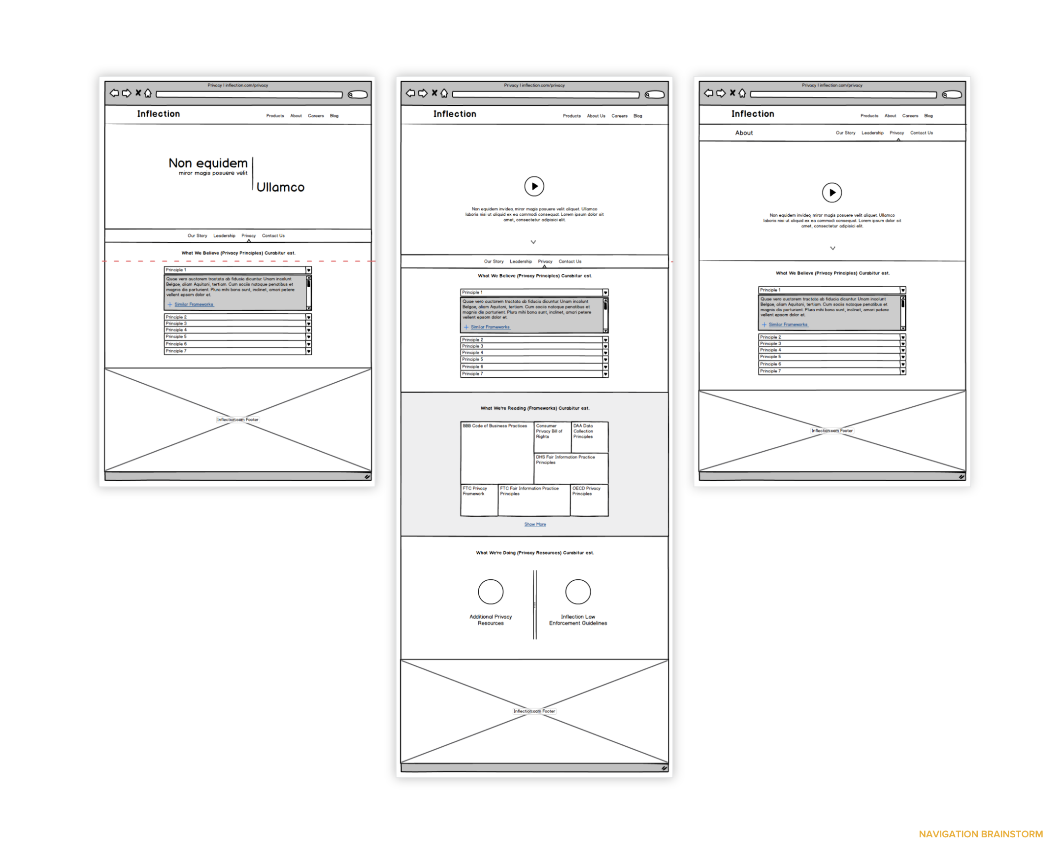
FIXED DOUBLE NAV OR FIXED MAIN
While finalizing the styling and layout of the new navigation, we kept going back and forth about the interaction of the navigation. We were divided on whether both the main and sub navigation be fixed at the top of the screen or only the main navigation be sticky with the sub navigation appearing on hover. There was concern that users would not interact with the sub navigation if it wasn’t fixed so we decided to go with a fixed double navigation.
However, we were displeased with the amount of vertical space the navigation took up, a problem we had with the existing one. I decided to run a quick user test on 5 participants to see if users interacted more with the main or sub navigation. The results showed users still interacted with the main navigation more even with a fixed sub-navigation when they first arrived at a page and when trying to navigate through the site. But as they neared the end of a page, they would often wander within the sub navigation to see other subsections. With these findings in mind, I decided to go with the final approach below.

CAN'T FORGET MOBILE
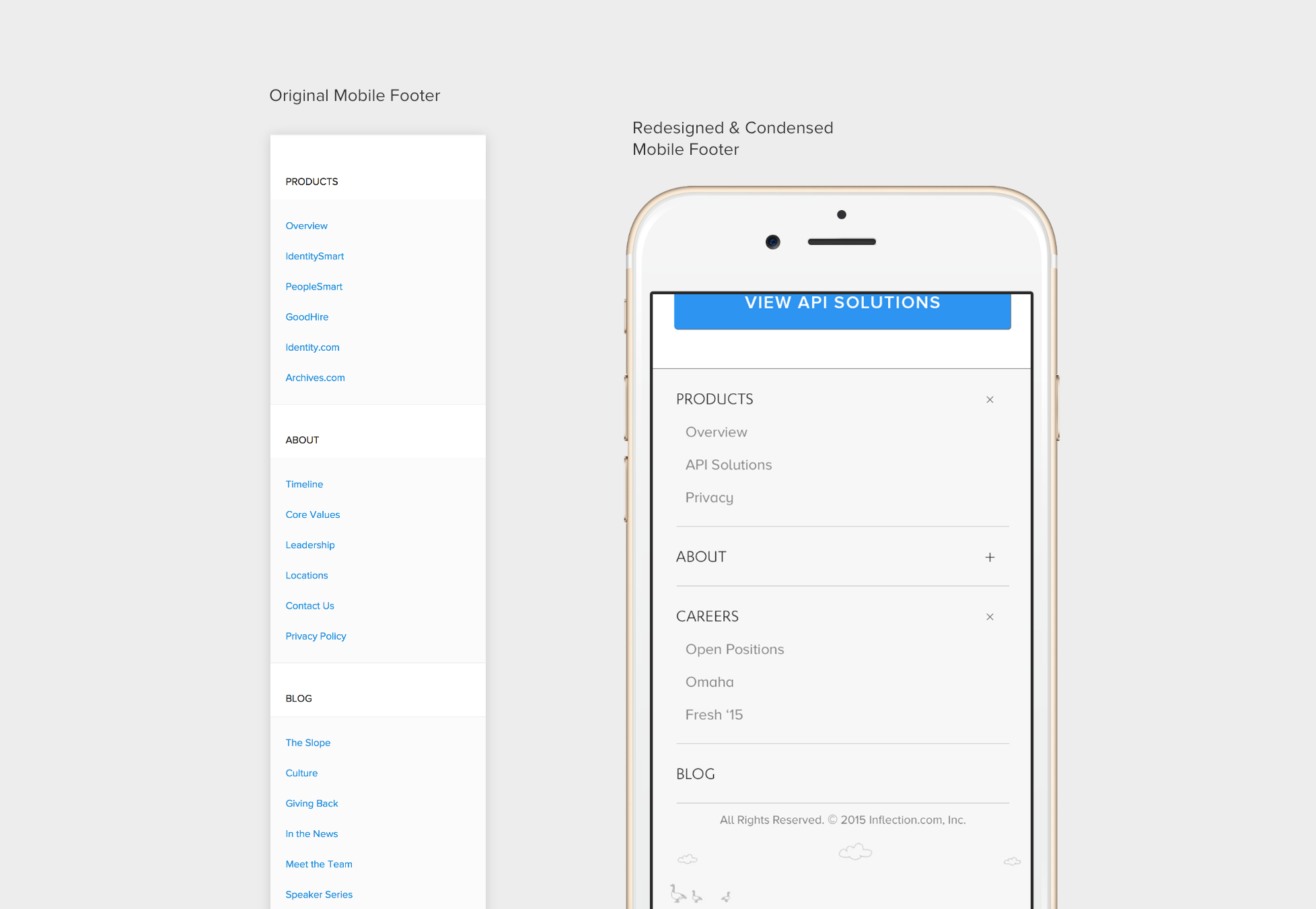
Although majority of our users came in on the desktop experience, we still accounted for mobile throughout this endeavor, especially navigation.
With so many pages being pushed to the footer on our site, the mobile footer had gotten out of hand, taking up a huge amount of vertical space. Using crazyegg page metrics, I noticed a large amount of our mobile users interacted a lot with certain pages (products overview, Open Positions) and not at all with others. This informed many of the design decisions made with the upgraded footer seen below.
Like what you see? Well there's more:
Community Safety Web Portal
The community safety web portal provides automated background checks for peer to peer platforms quickly, accurately and at scale.
2016
PeopleSmart
PeopleSmart is a privacy friendly people search engine that allows users to access public records information.
2016
Fresh 15
Inflection's 2015 recruiting campaign created to target the most talented recent graduates in the country.
2016